Our Team has been very busy working behind the scenes.
This month we introduced some new Widgets that allow for advanced views of sensor data to complete your decision support needs. Try them out!
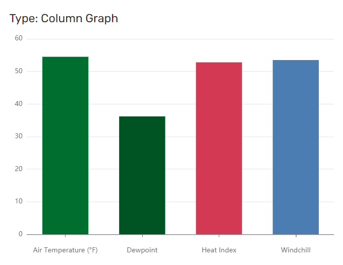
Column Graph and Bar Chart Widgets
New Column Graphs (shown left) and Bar Chart Widgets allows you to quickly compare totals across multiple Sensors or Sites.
You can set the min and max scale and selectively turn on the Site and Sensor labels. Additional range coloring capabilities are also available.
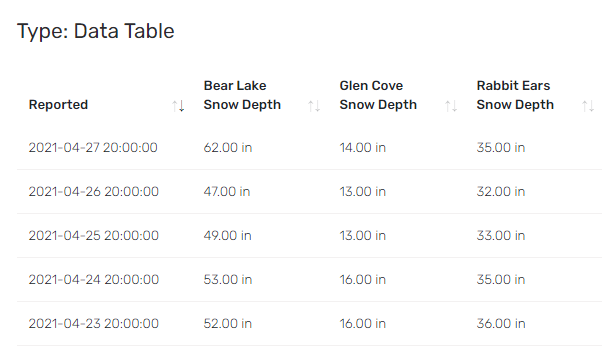
Data Table Widget
The Data Table widget is ideal for time series data and allows you to look at multiple sensors on the same Table Widget. Some examples might be where you want look at all the water level totals in a watershed, or all of the sensor reports at a weather station. The data table will automatically make a row for each report and combine reports with the same date and time stamp.
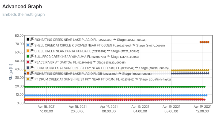
Advanced Multi-graph Widgets
Now you can embed advanced Multi-graph Widgets within Contrail Dashboards. Get a combined view of multiple sites natively within a Dashboard.
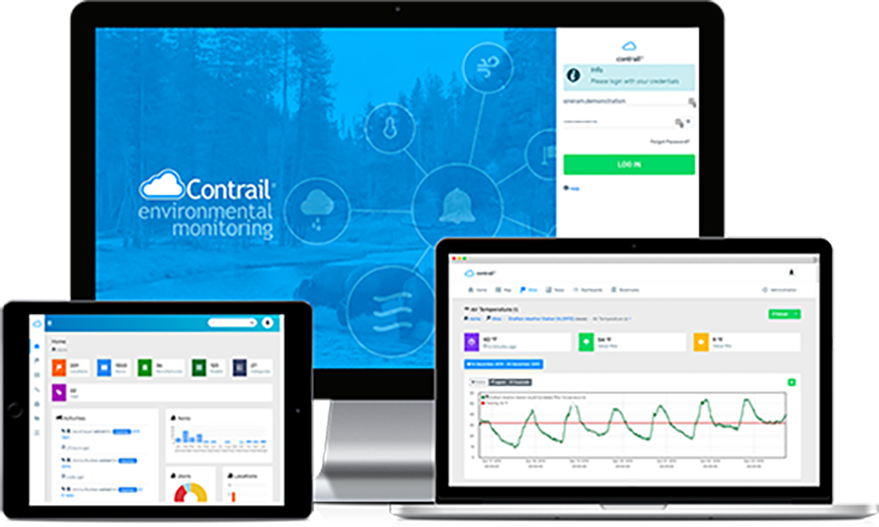
About Contrail
Contrail is the leading enterprise-level software platform that collects, processes and delivers real-time environmental sensor data from local hydrometeorological networks and other external sources for Web-based dissemination, visualization, monitoring and automated alerting. The software provides critical information to help users understand and manage their environmental monitoring-related missions—from flood and road weather safety, to dams, stormwater, wastewater and water resource management—and is key to effective situational awareness and timely decision-making.
Sign up to keep up to date with our product announcements, training, webinars, company news and more